API Reference
A list of components, hooks, and constants provided by @xrift/world-components. These can be used from both world and item development (world-only items such as SpawnPoint / DevEnvironment / useSpawnPoint are called out on each entry).
Components
Interactable
Creates an object that can be clicked/interacted with.
import { Interactable } from '@xrift/world-components';

<Interactable id="my-button" onInteract={() => console.log('clicked!')}>
  <mesh>
    <boxGeometry args={[1, 1, 1]} />
    <meshStandardMaterial color="hotpink" />
  </mesh>
</Interactable>
Props
| Prop | Type | Default | Description |
|---|---|---|---|
id | string | - | Unique identifier (Required) |
onInteract | (id: string) => void | - | Callback on interaction (receives the object ID) |
interactionText | string | - | Text displayed on hover |
enabled | boolean | true | Enable/disable interaction |
type | 'button' | - | Object type |
children | ReactNode | - | Object to be interacted with (Required) |
Grabbable
A wrapper component that declares an object as "grabbable". Like Interactable, it makes the wrapped object explicitly opt in. Players can grab the object, float it in front of their view, and place it anywhere.
It puts child meshes on LAYERS.GRABBABLE (layer 14). The grabbing foundation (raycasting, following, committing) is handled by the platform. During development, you can test it with the system bundled in DevEnvironment.
The coordinates of transform and onMove are in the local space of the parent where you place the Grabbable (the same as a normal position prop). Even when nested under a transformed parent group, they are converted to/from world coordinates internally, so the release position never drifts.
import { useState } from 'react';
import { Grabbable, type GrabbableTransform } from '@xrift/world-components';

function GrabbableBall() {
  const [transform, setTransform] = useState<GrabbableTransform>({
    position: { x: 2, y: 0.5, z: -2 },
    rotation: { x: 0, y: 0, z: 0 },
  });

  return (
    <Grabbable
      id="ball"
      transform={transform}
      onMove={(next) => setTransform((prev) => ({ ...prev, ...next }))}
    >
      {/* Write children in local coordinates (relative to origin) */}
      <mesh>
        <sphereGeometry args={[0.3]} />
        <meshStandardMaterial color="gold" />
      </mesh>
    </Grabbable>
  );
}
Props
| Prop | Type | Default | Description |
|---|---|---|---|
id | string | - | Unique identifier (Required) |
transform | GrabbableTransform | - | Current pose of the object (Required). Specified in the parent's local coordinates and applied to the root group (children are written relative to the origin) |
onMove | (transform: GrabResultTransform) => void | - | Receives the new pose when released/committed (Required). Returned in the same parent-local coordinates as transform, so reflect it in state to update transform |
renderGhost | () => ReactNode | - | Returns the ghost (semi-transparent, no physics) shown while grabbing, in local coordinates. Falls back to children if omitted |
enabled | boolean | true | Whether it is grabbable (false to temporarily disable) |
children | ReactNode | - | The grabbable object (written in local coordinates, Required) |
GrabbableTransform / GrabResultTransform
interface GrabbableTransform {
  position: { x: number; y: number; z: number };  // Parent-local coordinates (same as a normal position prop)
  rotation: { x: number; y: number; z: number };  // Euler angles (radians)
  scale?: number;                                   // Uniform scale (defaults to 1)
}

interface GrabResultTransform {
  position: { x: number; y: number; z: number };
  rotation: { x: number; y: number; z: number };
}
If children include physics (such as RigidBody), you must provide a physics-free version via renderGhost. Otherwise children is rendered as the ghost directly, and the collider of the real object and the ghost overlap while grabbing.
Grabbing assumes desktop (pointer lock + center crosshair). In DevEnvironment, press G to grab/place, use the mouse wheel to adjust distance, click to commit, and Esc (releasing pointer lock) to cancel.
Seat
A wrapper component that declares an object as "sittable". Like Interactable, it makes the wrapped object explicitly opt in. When a player sits, their view, pose, and body orientation follow the seat; they stand up with Space (the A button in VR).
Place Seat as a group. Its origin is the seating surface (where the hips go) and its forward direction is -Z. Write children in local coordinates relative to that surface.
The surface transform is derived from the world matrix of wherever you placed the Seat, every frame. Because of that, nesting it under a moving vehicle, a turntable, or a tilted group just works — the player follows along. You place it; you never pass the transform yourself.
import { Seat } from '@xrift/world-components';

function Stool() {
  const height = 0.45;

  return (
    // Place the Seat at the height of the seating surface
    <Seat id="stool-1" position={[2, height, -3]} rotation={[0, Math.PI / 2, 0]}>
      {/* Children are relative to the surface, so drop the box by half its height */}
      <mesh position={[0, -height / 2, 0]}>
        <boxGeometry args={[0.5, height, 0.5]} />
        <meshStandardMaterial color="saddlebrown" />
      </mesh>
    </Seat>
  );
}
Props
Group properties such as position and rotation can be passed directly (except scale — see below).
| Prop | Type | Default | Description |
|---|---|---|---|
id | string | - | Unique identifier (required) |
exitOffset | SeatExitOffset | { forward: 0.6, right: 0, up: 0 } | Where the player is placed on standing up. Relative to the seat's facing, in world meters |
interactionText | string | '座る' | Text shown when the player aims at the seat |
enabled | boolean | true | Whether the seat can be used (false disables it temporarily; it is disabled automatically while someone else is seated) |
onEnter | (occupant: SeatOccupant) => void | - | Called when someone sits down (yourself or anyone else) |
onLeave | (occupant: SeatOccupant) => void | - | Called when someone stands up (yourself or anyone else) |
driver | boolean | false | Makes this the driver seat of the surrounding Vehicle (0.52.0+) |
onControlInput | (input: SeatControlInput, delta: number) => void | - | Steering input, for seats that are not vehicles (turrets, swivel chairs) |
children | ReactNode | - | The object to sit on, in coordinates relative to the seating surface (required) |
SeatOccupant
interface SeatOccupant {
  id: string;           // the player's userId
  isLocalUser: boolean; // whether it is you
}
No display name or icon. Look them up from useUsers() by id if you need them (they become unavailable once the player leaves).
Receiving steering input (onControlInput)
To make a vehicle, use Vehicle (below). onControlInput is for seats that are not vehicles — a turret, a swivel chair, a crane — where you want the steering input but own no vehicle transform. It arrives every frame, only while you are the one sitting in it.
<Seat
  id="turret-1"
  position={[0, 0.5, 0]}
  onControlInput={(input, delta) => {
    // turn just the barrel
    barrelYaw.current -= input.right * TURN_RATE * delta;
  }}
>
  {/* ... */}
</Seat>
SeatControlInput
interface SeatControlInput {
  forward: number;  // Forward is +1, backward -1 (W / S on a keyboard)
  right: number;    // Right is +1, left -1 (D / A on a keyboard)
}
What you receive is which way the player wants to move, not how far. Whether right means steering or strafing is for your vehicle to decide.
You can read raw keys with window.addEventListener('keydown'), but onControlInput gives you three things they cannot.
- It arrives the same way in VR and on mobile (thumbsticks, virtual joystick)
- It is limited to the person seated. With raw keys, someone who is not aboard can press W and move things on their own screen, drifting out of sync with everyone else
- It does not fight with player movement (WASD does not walk you around while seated)
onControlInput (or onDrive on a Vehicle) fires on the driver's screen alone. XRift does not run physics on every client and reconcile them.
Because of that, state should be held as local state on the driver's client — do not sync it with useInstanceState. With Vehicle the pose is synced for you, so doing both means managing it twice.
SeatExitOffset
interface SeatExitOffset {
  forward?: number;  // Toward the front (-Z). Default 0.6
  right?: number;    // To the right. Default 0
  up?: number;       // Along world up. Default 0
}
forward and right are rotated by the seat's horizontal facing (yaw) only. up is world up: placing the player along the seat's own up axis would bury them in the ground when they leave a vehicle that is upside down mid-loop.
Use it for seats you cannot leave forwards, such as a chair at a table.
{/* Exit to the right */}
<Seat id="booth-seat" exitOffset={{ forward: 0, right: 0.7 }}>
  {/* ... */}
</Seat>
The origin of Seat is the seating surface. To turn a box resting on the floor into a seat, place the Seat itself at the surface height and draw the child box below it. Aligning the origin with the floor makes players sit sunk into it.
The surface is defined by position and orientation alone, and the seated hip and eye heights come from the player's own avatar, so scaling a seat means nothing. To change how it looks, scale the children instead.
If an ancestor group is scaled, the surface position and orientation are still correct, but exitOffset distances are not scaled (they are always world meters).
While another player is seated, the seat behaves as enabled={false} and shows no prompt. If two players sit at almost the same moment, both may succeed — they simply overlap visually; no state is corrupted.
DevEnvironment bundles a single-player seat system, so you can sit down and try it with npm run dev as-is. Aim at a seat and click to sit, press Space to stand up. Sitting in a Vehicle driver's seat lets you drive it with WASD. Verify multi-user appearance and sync on XRift.
Vehicle
A rideable vehicle. Put Seats inside it and mark one with driver to make it drivable.
Vehicle owns the transform. You write only how you want it to move, in onDrive; the syncing is handled for you.
- On the driver's client: it moves by what
onDrivewrites, and that pose is what gets synced - On everyone else's client:
onDriveis not called; the arriving pose is applied instead
The whole body moves, so empty passenger seats end up in the right place too, and exactly one pose is synced per vehicle.
import { Seat, Vehicle } from '@xrift/world-components';

const SPEED = 3;       // m/s
const TURN_RATE = 1.8; // rad/s

function Cart() {
  return (
    <Vehicle
      id="cart-1"
      position={[0, 0, -5]}
      onDrive={(input, delta, vehicle) => {
        // drive along the body's forward axis, so a slope is followed automatically
        vehicle.translateZ(-input.forward * SPEED * delta);
        // turn relative to where it is already facing
        vehicle.rotateY(-input.right * TURN_RATE * delta);
      }}
    >
      {/* the body, in the vehicle's local coordinates */}
      <mesh position={[0, 0.25, 0]}>
        <boxGeometry args={[1.2, 0.3, 2]} />
        <meshStandardMaterial color="tomato" />
      </mesh>

      {/* the driver seat */}
      <Seat id="cart-1-driver" driver position={[0, 0.45, -0.35]} exitOffset={{ forward: 0, right: -1.2 }}>
        <mesh><boxGeometry args={[0.5, 0.1, 0.5]} /><meshStandardMaterial color="steelblue" /></mesh>
      </Seat>

      {/* a passenger seat - cannot drive, but moves with the body */}
      <Seat id="cart-1-back" position={[0, 0.45, 0.55]} exitOffset={{ forward: 0, right: 1.2 }}>
        <mesh><boxGeometry args={[0.5, 0.1, 0.5]} /><meshStandardMaterial color="seagreen" /></mesh>
      </Seat>
    </Vehicle>
  );
}
| Prop | Type | Default | Description |
|---|---|---|---|
id | string | - | Unique identifier for the vehicle (required) |
onDrive | (input: SeatControlInput, delta: number, vehicle: THREE.Group) => void | - | Moves the vehicle. Called every frame only while you are in the driver seat |
Group properties such as position and rotation can be passed directly.
vehicle (the third argument to onDrive)
The three.js Group itself. Writing to it moves the vehicle:
vehicle.rotateY(rad)— turnvehicle.translateZ(-distance)— drive toward the body's own forward, so slopes work for freevehicle.quaternion— set it directly for slopes, banking, even loops
Adding to position.x / position.z by a heading angle throws the tilt away, so the vehicle floats above or sinks into a slope. translateZ moves along the body's forward axis, so following a slope comes for free.
position and rotation set where it starts. After that the transform belongs to Vehicle (onDrive on the driver's client, the arriving pose on everyone else's). Passing a changing value to position fights whichever one is in charge.
On a Seat outside one, driver is ignored and the seat behaves as an ordinary chair (with a console warning during development).
The position after the driver gets off is kept for the instance, so someone who joins later sees the vehicle where it was left rather than back at its starting position.
Vehicle and Seat's driver require @xrift/world-components 0.52.0 or later.
Mirror
Creates a real-time reflective surface.
import { Mirror } from '@xrift/world-components';

<Mirror position={[0, 1, -5]} />
Props
| Prop | Type | Default | Description |
|---|---|---|---|
position | [number, number, number] | [0, 0, 0] | Mirror position |
rotation | [number, number, number] | [0, 0, 0] | Mirror rotation |
size | [number, number] | - | Mirror size [width, height] |
color | number | 0xcccccc | Reflection color |
textureResolution | number | 512 | Reflection texture resolution (auto-adjusted by size ratio) |
lodDistance | number | 10 | Distance in meters to switch to envMap-based pseudo-mirror |
VideoScreen
Creates a screen that plays synchronized video.
import { VideoScreen } from '@xrift/world-components';

<VideoScreen
  id="bg-video"
  url="https://example.com/video.mp4"
  scale={[4, 2.25]}
/>
Props
| Prop | Type | Default | Description |
|---|---|---|---|
id | string | - | Unique screen ID (Required) |
position | [number, number, number] | [0, 0, 0] | Screen position |
rotation | [number, number, number] | [0, 0, 0] | Screen rotation |
scale | [number, number] | - | Screen size [width, height] |
url | string | - | Video URL |
playing | boolean | true | Playing state |
currentTime | number | - | Playback position in seconds |
sync | 'global' | 'local' | 'global' | Sync mode |
muted | boolean | false | Muted state |
volume | number | 1 | Volume (0-1) |
VideoScreen is a simple screen without UI controls. Use VideoPlayer if you need play/pause buttons or a progress bar.
VideoPlayer
A video player with UI controls based on VideoScreen. It features VR-compatible control UIs such as play/pause buttons, progress bar, and volume bar.
import { VideoPlayer } from '@xrift/world-components';

<VideoPlayer
  id="my-video"
  url="https://example.com/video.mp4"
  position={[0, 2, -5]}
  width={4}
/>
Props
| Prop | Type | Default | Description |
|---|---|---|---|
id | string | - | Unique ID for the screen (Required) |
position | [number, number, number] | [0, 2, -5] | Position of the screen |
rotation | [number, number, number] | [0, 0, 0] | Rotation of the screen |
width | number | 4 | Width of the screen (Height is automatically calculated at 16:9) |
url | string | - | URL of the video (optional) |
playing | boolean | true | Initial playback state |
volume | number | 1 | Initial volume (0-1) |
sync | 'global' | 'local' | 'global' | Sync mode |
Features
- URL Input Button: Clicking the 🔗 icon displays a URL input overlay, allowing dynamic switching of the video source.
- Play/Pause Button: Toggle playback state with the ▶/|| icon.
- Progress Bar: A progress bar divided into 20 segments. Click to return to the beginning of the video.
- Volume Bar: Adjusts from 0-100% in increments of 10. Displays mute status with 🔈/🔇 icons.
- VR Support: Supports VR controller operation using
Interactable.
You can select the sync mode with the sync property:
'global': Synchronize playback state across all users (Default)'local': Each user controls playback independently
LiveVideoPlayer
A video player that supports live streaming playback such as HLS/DASH. While having similar UI controls to VideoPlayer, it is optimized for live streaming.
import { LiveVideoPlayer } from '@xrift/world-components';

<LiveVideoPlayer
  id="my-live"
  url="https://example.com/live/stream.m3u8"
  position={[0, 2, -5]}
  width={4}
/>
Props
| Prop | Type | Default | Description |
|---|---|---|---|
id | string | - | Unique ID for the screen (Required) |
position | [number, number, number] | [0, 2, -5] | Position of the screen |
rotation | [number, number, number] | [0, 0, 0] | Rotation of the screen |
width | number | 4 | Width of the screen (Height is automatically calculated at 16:9) |
url | string | - | Stream URL (HLS/DASH supported) |
playing | boolean | false | Initial playback state |
volume | number | 1 | Initial volume (0-1) |
sync | 'global' | 'local' | 'global' | Sync mode |
Features
- URL Input Button: Clicking the 🔗 icon displays a URL input overlay, allowing dynamic switching of the stream source.
- Play/Pause Button: Toggle playback state with the ▶/|| icon.
- Volume Bar: Adjusts from 0-100% in increments of 10. Displays mute status with 🔈/🔇 icons.
- VR Support: Supports VR controller operation using
Interactable.
Since LiveVideoPlayer is designed for live streaming, it does not have a progress bar (seek function). Please use VideoPlayer for playing recorded videos.
ScreenShareDisplay
Displays the screen sharing video as a screen in the 3D space. It retrieves video and status from ScreenShareContext.
import { ScreenShareDisplay } from '@xrift/world-components';

<ScreenShareDisplay id="screen-1" position={[0, 2, -5]} />
Props
| Prop | Type | Default | Description |
|---|---|---|---|
id | string | - | Unique ID for the screen (Required) |
position | [number, number, number] | [0, 0, 0] | Position of the screen |
rotation | [number, number, number] | [0, 0, 0] | Rotation of the screen |
width | number | 4 | Width of the screen (Height is automatically calculated at 16:9) |
targetFps | number | - | Texture update FPS limit for low-spec devices (unlimited when omitted) |
placeholderImageUrl | string | - | URL of a placeholder image shown while no screen is being shared |
The aspect ratio of the video is automatically maintained. Video other than 16:9 will be displayed correctly with black bars.
When placeholderImageUrl is specified, the image is displayed on the screen while no screen is being shared. The image is fitted inside the screen (contain), and if loading fails, the display falls back to the background color and guide text.
Since the image is loaded as a WebGL texture, specify an image URL that allows CORS (images uploaded to xrift work as-is).
Only one screen can be shared per world. While it is possible to place multiple ScreenShareDisplay components, they will all display the same screen.
SpawnPoint
Specifies the point where players spawn in the world.
SpawnPoint sets the world-level spawn location. It is not intended to be used from within an item.
import { SpawnPoint } from '@xrift/world-components';

<SpawnPoint />
<SpawnPoint position={[0, 0, 5]} yaw={180} />
Props
| Prop | Type | Default | Description |
|---|---|---|---|
position | [number, number, number] | [0, 0, 0] | Spawn position |
yaw | number | 0 | Orientation at spawn (degrees 0-360) |
In the development environment, the spawn position and direction are visualized with a semi-transparent cylinder (gradient transparency from bottom to top) and an arrow. The helper is not displayed in the production build.
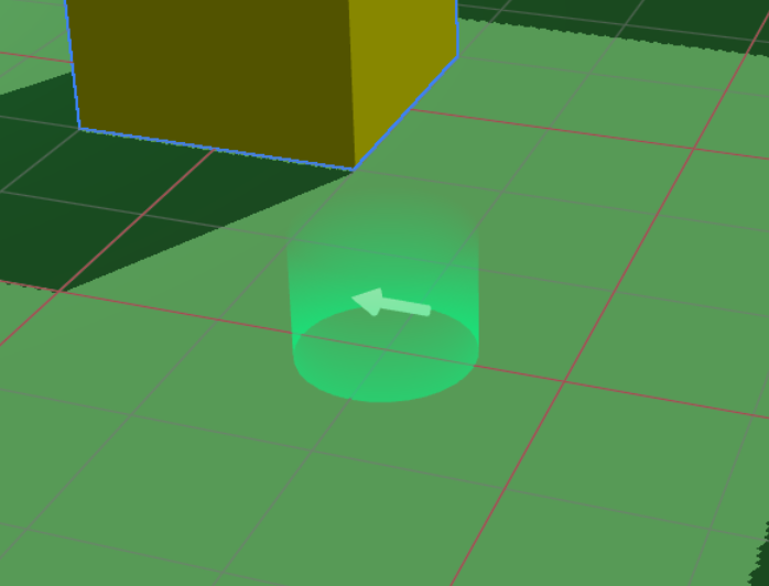
If multiple SpawnPoint components are placed, the one set last takes effect.
TextInput
A component that enables text input in 3D space. You can customize the appearance freely using the children method.
import { TextInput } from '@xrift/world-components';

<TextInput
  id="my-input"
  value={inputValue}
  onSubmit={handleSubmit}
  placeholder="Enter text..."
>
  <mesh>
    <boxGeometry args={[1, 0.5, 0.1]} />
    <meshStandardMaterial color="#333" />
  </mesh>
</TextInput>
Props
| Prop | Type | Default | Description |
|---|---|---|---|
id | string | - | Unique ID for the input field (Required) |
children | ReactNode | - | 3D object (Appearance) (Required) |
placeholder | string | - | Placeholder text |
maxLength | number | - | Maximum number of characters |
value | string | - | Current value |
onSubmit | (value: string) => void | - | Callback on input completion |
interactionText | string | 'Click to enter' | Text to display on interaction |
disabled | boolean | false | Whether to disable input |
Mechanism
The TextInput component operates with the following architecture:
- TextInput: Displays the 3D object passed as children as a clickable input field.
- Overlay Input: Upon clicking, a 2D text input UI is displayed as an overlay to accept actual input.
- XRiftContext Integration: world-components requests the overlay display via XRiftContext.
By passing any 3D object to children, you can freely customize the appearance of the input field. You can achieve button-like designs or looks that match the world's atmosphere.
The platform side uses the following APIs to implement TextInput behavior:
TextInputContextuseTextInputContextTextInputContextValueTextInputRequest
TagBoard
A component that handles tags selected by users locally/globally, providing a board UI (TagSelector) and tag display above each user's head (TagDisplay).
import { TagBoard } from '@xrift/world-components';

<TagBoard
  instanceStateKey="main-tag-board"
  position={[0, 1.5, -3]}
/>
Props
| Prop | Type | Default | Description |
|---|---|---|---|
tags | Tag[] | Default tag list | Tags to display/select |
columns | number | 3 | Number of display columns |
title | string | "Select Tag" | Title text |
instanceStateKey | string | - | Instance state key (Required, for identification when placing multiple boards) |
position | [number, number, number] | [0, 0, 0] | Position of the board |
rotation | [number, number, number] | [0, 0, 0] | Rotation of the board |
scale | number | 1 | Overall scale |
Tag Type Definition
interface Tag {
  id: string;      // Unique identifier for the tag
  label: string;   // Display label
  color: string;   // Color (HEX format)
}
Default Tag List
If the tags property is omitted, the following tags are used:
[
  { color: "#2ECC71", id: "want-talk", label: "Want to talk" },
  { color: "#3498DB", id: "want-listen", label: "Want to listen" },
  { color: "#95A5A6", id: "silent", label: "Silent" },
  { color: "#1ABC9C", id: "developer", label: "Developer" },
  { color: "#2980B9", id: "student", label: "Student" },
  { color: "#F1C40F", id: "beginner", label: "Beginner" },
  { color: "#9B59B6", id: "dont-know", label: "Don't know anything" },
  { color: "#8BC34A", id: "working", label: "Working" },
  { color: "#BF7B41", id: "away", label: "Away" },
  { color: "#FF9800", id: "cat", label: "Cat" },
]
Usage Example
Using Custom Tags
import { TagBoard, type Tag } from '@xrift/world-components';

const customTags: Tag[] = [
  { id: "frontend", label: "Frontend", color: "#61DAFB" },
  { id: "backend", label: "Backend", color: "#68A063" },
  { id: "design", label: "Design", color: "#FF6B6B" },
  { id: "pm", label: "PM", color: "#9B59B6" },
];

export const MyWorld = () => {
  return (
    <TagBoard
      tags={customTags}
      columns={2}
      title="What is your role?"
      instanceStateKey="role-tag-board"
      position={[0, 1.5, -3]}
      rotation={[0, 0, 0]}
      scale={1.2}
    />
  );
};
instanceStateKey must be unique within the same world. If placing multiple TagBoards, specify a different instanceStateKey for each.
UsersContextis required (used for retrieving user information).- Uses
useInstanceStatehook internally (synchronization of tag selection state).
DevEnvironment
A component that provides a local development environment. Used in the world template's dev.tsx.
DevEnvironment is for local preview when running npm run dev in a world development project. Do not use it inside actual world content such as World.tsx. It is also not used for item development (the item template uses its own dev.tsx).
import { DevEnvironment, XRiftProvider } from '@xrift/world-components'
import { World } from './World'
import xriftConfig from '../xrift.json'

createRoot(rootElement).render(
  <StrictMode>
    <XRiftProvider baseUrl="/">
      <DevEnvironment
        physicsConfig={xriftConfig.world?.physics}
        camera={{ near: xriftConfig.world?.camera?.near, far: xriftConfig.world?.camera?.far }}
      >
        <World />
      </DevEnvironment>
    </XRiftProvider>
  </StrictMode>
)
Props
| Prop | Type | Default | Description |
|---|---|---|---|
children | ReactNode | - | World content (Required) |
camera | { position?: [x, y, z]; fov?: number; near?: number; far?: number } | { fov: 50, near: 0.01, far: 1000 } | Camera settings |
moveSpeed | number | 5.0 | Movement speed |
shadows | boolean | true | Enable/disable shadows |
spawnPosition | [x, y, z] | [0.11, 1.6, 7.59] | Spawn position |
respawnThreshold | number | -10 | Y-coordinate threshold for respawn |
physicsConfig | PhysicsConfig | - | Physics settings |
CameraConfig
Clipping distances configurable via the camera prop. Corresponds to the world.camera settings in xrift.json.
| Prop | Type | Default | Description |
|---|---|---|---|
near | number | 0.01 | Near clipping distance |
far | number | 1000 | Far clipping distance |
PhysicsConfig
| Prop | Type | Default | Description |
|---|---|---|---|
gravity | number | 9.81 | Gravitational acceleration |
allowInfiniteJump | boolean | true | Allow infinite jumping |
Features
- First-Person Player: Physics-based WASD movement, jumping, and respawning
- View Controls: View manipulation via PointerLockControls
- Interaction: Raycasting to INTERACTABLE layer + click interaction
- Grabbing (Grabbable): Raycasting to GRABBABLE layer + following the view and committing
- Sitting & Driving (Seat / Vehicle): Single-player seat system. Aim at a seat and click to sit; WASD becomes drive input while seated, Space to stand up
- Crosshair UI: Center-screen crosshair (highlights on hit)
- Guide UI: Pointer lock state guidance UI
- Controls Help UI: UI displaying control instructions
Controls
| Input | Description |
|---|---|
| Click | Start pointer lock / Interact / Commit while grabbing / Sit on seats |
| WASD / Arrow Keys | Movement (driving while seated) |
| Space / E | Jump (stand up while seated) |
| G | Grab / Place (Grabbable targets) |
| Mouse Wheel | Adjust distance while grabbing |
| ESC | Release pointer lock (cancels while grabbing) |
Installation of @react-three/rapier (^2.0.0) is required (optional peerDependency).
Portal
A component that displays a portal for moving to another instance. It consists of a swirl shader effect, destination thumbnail/world name/instance name/user count, particles, glow, and a clickable pedestal.
When instanceId is specified, it automatically fetches and displays information about the target instance. Clicking the pedestal triggers a confirmation modal (useConfirm) before transitioning to the target instance.
import { Portal } from '@xrift/world-components'

function MyWorld() {
  return (
    <Portal
      instanceId="ceffb128-23c7-4120-b4e6-19bf6c604c47"
      position={[5, 0, 0]}
      rotation={[0, Math.PI / 2, 0]}
    />
  )
}
Props
| Prop | Type | Default | Description |
|---|---|---|---|
instanceId | string | - | ID of the destination instance (Required) |
position | [number, number, number] | [0, 0, 0] | Position of the portal |
rotation | [number, number, number] | [0, 0, 0] | Rotation of the portal |
disabled | boolean | false | Disable portal navigation |
The instance ID is a UUID found in the instance page URL. For example, in https://app.xrift.net/instance/ceffb128-23c7-4120-b4e6-19bf6c604c47, the instance ID is ceffb128-23c7-4120-b4e6-19bf6c604c47.
Portal internally uses the useInstance hook to fetch instance information and handle navigation.
Skybox
Creates a gradient sky background.
import { Skybox } from '@xrift/world-components';

<Skybox topColor={0x87ceeb} bottomColor={0xffffff} />
Props
| Prop | Type | Default | Description |
|---|---|---|---|
topColor | number | 0x87ceeb | Top color |
bottomColor | number | 0xffffff | Bottom color |
offset | number | 0 | Gradient start position |
exponent | number | 1 | Gradient range |
Video180Sphere
A component that plays 180-degree VR video projected onto a hemisphere.
import { Video180Sphere } from '@xrift/world-components';

<Video180Sphere
  url="https://example.com/vr-video-180.mp4"
  position={[0, 1.5, 0]}
  radius={5}
  loop
/>
Props
| Prop | Type | Default | Description |
|---|---|---|---|
url | string | - | 180-degree video URL (Required) |
position | [number, number, number] | [0, 0, 0] | Position |
rotation | [number, number, number] | [0, 0, 0] | Rotation |
scale | number | [number, number, number] | - | Scale |
playing | boolean | true | Playing state |
muted | boolean | - | Muted state (set to true to bypass autoplay restrictions) |
volume | number | 1 | Volume (0-1) |
radius | number | - | Hemisphere radius |
segments | number | - | Geometry resolution (segment count) |
loop | boolean | - | Loop playback |
placeholderColor | string | 'black' | Placeholder color before video loads |
onEnded | () => void | - | Playback ended callback |
onLoadedMetadata | (event: { duration: number }) => void | - | Metadata loaded callback |
onProgress | (event: { currentTime: number }) => void | - | Progress update callback |
EntryLogBoard
Displays a log of user join/leave events in the instance.
import { EntryLogBoard } from '@xrift/world-components';

<EntryLogBoard
  position={[3, 1.5, -2]}
  rotation={[0, -0.5, 0]}
  maxEntries={10}
/>
Props
| Prop | Type | Default | Description |
|---|---|---|---|
stateNamespace | string | - | Instance state key (for multi-board identification) |
maxEntries | number | - | Maximum display entries |
formatTimestamp | (timestampMs: number) => string | - | Timestamp format function (receives epoch ms) |
displayNameFallback | string | - | Fallback when display name is unavailable |
labels | Partial<Labels> | - | Customize labels (join, leave) |
colors | Partial<Colors> | - | Customize colors (join, leave, background, text) |
position | [number, number, number] | [0, 0, 0] | Board position |
rotation | [number, number, number] | [0, 0, 0] | Board rotation |
scale | number | 1 | Overall scale |
onJoin | (entry: LogEntry) => void | - | Join event callback |
onLeave | (entry: LogEntry) => void | - | Leave event callback |
EntryLogBoard writes your own join entry locally, syncs logs via useInstanceState
with server-clock (useServerClock) timestamps, and uses useInstanceEvent to receive
user-left events.
Hooks
useInstanceState
Synchronizes state across all users in the instance. It has the same interface as React's useState.
import { useInstanceState } from '@xrift/world-components';

function Counter() {
  const [count, setCount] = useInstanceState('counter', 0);

  return (
    <mesh onClick={() => setCount(count + 1)}>
      {/* count is synchronized across all users */}
    </mesh>
  );
}
Arguments
| Argument | Type | Description |
|---|---|---|
key | string | Unique identifier for the state |
initialValue | T | Initial value |
Return Value
[value: T, setValue: (newValue: T) => void] - Same format as useState
useInstanceEvent
A hook for sending and receiving instance events. You can receive platform events (user-joined, user-left) and send/receive custom world events.
import { useInstanceEvent } from '@xrift/world-components';

// Receive platform events (receive only, cannot emit)
useInstanceEvent('user-joined', (data) => {
  console.log('User joined:', data)
})

// Send and receive custom events
const emitReaction = useInstanceEvent('reaction', (data) => {
  console.log('Reaction received:', data)
})
emitReaction({ emoji: '👍', userId: 'user-1' })
Arguments
| Argument | Type | Description |
|---|---|---|
eventName | string | Event name |
callback | (data: T) => void | Callback when event is received |
Return Value
(data: T) => void - Event emit function. Returns a no-op for platform reserved events (user-joined, user-left).
Event Types
| Type | Event Name | Send | Receive | Description |
|---|---|---|---|---|
| Platform | user-joined | - | ✅ | User joined the instance |
| Platform | user-left | - | ✅ | User left the instance |
| Custom | Any string | ✅ | ✅ | World-specific events |
Use Cases
Reaction System
import { useInstanceEvent } from '@xrift/world-components';
import { useCallback, useState } from 'react';

function ReactionSystem() {
  const [reactions, setReactions] = useState<{ emoji: string }[]>([]);

  const emitReaction = useInstanceEvent('reaction', (data: { emoji: string }) => {
    setReactions(prev => [...prev, data]);
  });

  const sendReaction = useCallback((emoji: string) => {
    emitReaction({ emoji });
  }, [emitReaction]);

  return (
    <mesh onClick={() => sendReaction('👍')}>
      <boxGeometry args={[1, 1, 0.2]} />
      <meshStandardMaterial color="yellow" />
    </mesh>
  );
}
Join/Leave Detection
import { useInstanceEvent } from '@xrift/world-components';

function JoinLeaveNotifier() {
  useInstanceEvent('user-joined', (data) => {
    console.log('User joined:', data);
  });

  useInstanceEvent('user-left', (data) => {
    console.log('User left:', data);
  });

  return null;
}
- useInstanceEvent: Best for transient event notifications (reactions, effect triggers, etc.).
- useInstanceState: Best for persistent synchronized state (counters, ON/OFF states, etc.).
In the development environment, a local EventEmitter is used, so events are only sent and received within the same browser. In production, the platform injects a WebSocket implementation, and events are shared across all users in the instance.
useServerClock
Provides a clock (server time) that agrees across every device in the instance. Device Date.now() values differ from each other by 0.1 to several seconds, so anything that requires "the same moment" — countdowns, simultaneous effects, video playback alignment, periodic animations that everyone sees in phase — must use this instead.
import { useServerClock } from '@xrift/world-components';
import { useFrame } from '@react-three/fiber';
import { useRef } from 'react';
import type { Mesh } from 'three';

// A floor that moves in the same phase on everyone's screen
// (zero networking; late joiners match instantly)
function MovingFloor() {
  const { now } = useServerClock();
  const floor = useRef<Mesh>(null);

  useFrame(() => {
    if (!floor.current) return;
    // Write position as a function of time. No state, so no sync logic needed
    floor.current.position.y = 1 + Math.sin(now() / 1000) * 0.5;
  });

  return (
    <mesh ref={floor}>
      <boxGeometry args={[2, 0.2, 2]} />
      <meshStandardMaterial color="skyblue" />
    </mesh>
  );
}
Arguments
| Argument | Type | Description |
|---|---|---|
options.require | 'media' | 'motion' (optional) | Accuracy requirement for your use case. Used to compute trustworthy |
Returns
| Property | Type | Description |
|---|---|---|
now | () => number | Estimated server time (ms). A function, not a value — call it from useFrame without re-rendering. Falls back to Date.now() before the first sync |
uncertainty | number | Upper bound of the estimation error (ms), including aging over time. Infinity before the first sync |
synced | boolean | Whether sync is currently established. Becomes false while disconnected, but now() keeps returning the last estimate |
trustworthy | boolean | Whether the clock meets the accuracy required via require. Same as synced if omitted |
timeJumpCount | number | Number of timeline jumps. If you accumulate deltas, re-baseline when this changes (see below) |
lastTimeJumpMs | number | Size of the most recent jump (ms); negative means the clock jumped backward |
Accuracy presets
| Preset | Required accuracy | Use case |
|---|---|---|
media | ±300ms | Video / music playback alignment |
motion | ±100ms | Periodic animations (moving floors, ferris wheels), simultaneous effects |
Measured accuracy is around ±40ms on both desktop and Quest (Wi-Fi), satisfying both presets.
The clock can occasionally "jump"
Normal corrections are applied gradually so the clock never rewinds, but it does jump on sleep/wake and when the initial sync completes. If you write positions as a function of time every frame (stateless), as in the example above, nothing is needed — it self-heals on the next frame. Only if you accumulate velocities or deltas, watch timeJumpCount and re-baseline:
const { now, timeJumpCount } = useServerClock();
const seen = useRef(timeJumpCount);

useFrame(() => {
  if (seen.current !== timeJumpCount) {
    seen.current = timeJumpCount;
    resetBaseline(); // the timeline jumped — re-baseline
  }
  // ...
});
Using it for video playback alignment
The rule is: never correct when the correction costs more than the error. Seeking discards the buffer and refetches segments (= playback stops), so never use it to fix small drift.
const clock = useServerClock({ require: 'media' });

useFrame(() => {
  if (!clock.trustworthy) return; // not accurate enough — give up syncing (keep playing)
  const target = ((clock.now() - epoch) / 1000) % duration;
  const diff = target - video.currentTime;
  if (Math.abs(diff) < 0.3) {
    video.playbackRate = 1; // dead band. Forgetting to reset causes endless oscillation
    return;
  }
  if (Math.abs(diff) < 5) {
    video.playbackRate = 1 + Math.sign(diff) * 0.05; // absorb without stopping the video
    return;
  }
  if (isBuffered(video, target)) video.currentTime = target; // seek only within the buffer
  // outside the buffer: do nothing (playback continuity beats sync)
});
Do not use this for buzzer contests or finish-line judgments. The error from asymmetric network paths cannot be detected client-side and stays nearly constant within a session, so it never averages out over repeated rounds (= the same person wins every time depending on their connection). Adjudicate outcomes on the server side instead.
In development the default implementation is used (synced: false, now() is the local clock), so trustworthy is always false. To exercise sync logic during development, inject a fake synced implementation into XRiftProvider in your dev entry:
<XRiftProvider
  baseUrl="/"
  serverClockImplementation={{
    now: () => Date.now(),
    uncertainty: 10,
    synced: true,
    timeJumpCount: 0,
    lastTimeJumpMs: 0,
  }}
>
Available in @xrift/world-components 0.47.0 and later.
useScreenShareContext
A hook to retrieve the state of screen sharing.
import { useScreenShareContext } from '@xrift/world-components';

function MyComponent() {
  const { videoElement, isSharing, startScreenShare, stopScreenShare } = useScreenShareContext();

  return (
    <button onClick={isSharing ? stopScreenShare : startScreenShare}>
      {isSharing ? 'Stop Sharing' : 'Start Sharing'}
    </button>
  );
}
Return Value
| Property | Type | Description |
|---|---|---|
videoElement | HTMLVideoElement | null | Video element to display |
isSharing | boolean | Whether the user is sharing |
startScreenShare | () => void | Start sharing |
stopScreenShare | () => void | Stop sharing |
useSpawnPoint
A hook for the platform side to retrieve spawn point information.
import { useSpawnPoint } from '@xrift/world-components';

function MyPlatform() {
  const spawnPoint = useSpawnPoint();
  // spawnPoint: { position: [x, y, z], yaw: number }
}
Return Value
| Property | Type | Description |
|---|---|---|
position | [number, number, number] | Spawn position |
yaw | number | Orientation at spawn (degrees) |
This hook is intended for use on the xrift-frontend (platform) side. World developers should use the SpawnPoint component.
useUsers
A hook to retrieve information and location of users participating in the world. You can access information about yourself (local user) and other participants (remote users).
import { useUsers } from '@xrift/world-components';

function ParticipantCount() {
  const { localUser, remoteUsers, getMovement, getLocalMovement } = useUsers();

  const totalCount = (localUser ? 1 : 0) + remoteUsers.length;

  return (
    <div>
      <p>Participants: {totalCount}</p>
    </div>
  );
}
Return Value
| Property | Type | Description |
|---|---|---|
localUser | User | null | Information about yourself |
remoteUsers | User[] | Array of information about other participants |
getMovement | (id: string) => PlayerMovement | undefined | Retrieve location information of a specific user |
getLocalMovement | () => PlayerMovement | Retrieve your own location information |
getAvatarHeight? | (id: string) => AvatarHeight | undefined | Retrieve avatar height information of a specific user |
getLocalAvatarHeight? | () => AvatarHeight | Retrieve your own avatar height information |
User Type
interface User {
  id: string;              // User ID
  displayName: string;     // Display name
  userIconUrl: string | null; // Avatar icon URL
  isGuest: boolean;        // Whether the user is a guest
}
PlayerMovement Type
interface PlayerMovement {
  position: { x: number; y: number; z: number };
  direction: { x: number; z: number };
  horizontalSpeed: number;
  verticalSpeed: number;
  rotation: { yaw: number; pitch: number };
  isGrounded: boolean;
  isJumping: boolean;
  isInVR?: boolean;
  vrTracking?: VRTrackingData;
}
AvatarHeight Type
interface AvatarHeight {
  height: number;    // Full height of the avatar (meters)
  eyeHeight: number; // Height from ground to the avatar's eye position (meters)
}
If the platform does not implement getAvatarHeight / getLocalAvatarHeight, default values of height: 1.5 and eyeHeight: 1.35 are returned. Since these are optional properties, use optional chaining (?.) when calling them.
Retrieving Position in useFrame
getMovement() and getLocalMovement() can be called every frame within useFrame. These functions allow retrieving the latest position information without triggering re-renders.
import { useUsers } from '@xrift/world-components';
import { useFrame } from '@react-three/fiber';
import { useRef } from 'react';
import { Group } from 'three';

function FollowCamera() {
  const groupRef = useRef<Group>(null);
  const { getLocalMovement } = useUsers();

  useFrame(() => {
    const movement = getLocalMovement();
    if (!groupRef.current) return;

    // Place an object slightly above your position
    groupRef.current.position.set(
      movement.position.x,
      movement.position.y + 3,
      movement.position.z
    );
  });

  return (
    <group ref={groupRef}>
      <pointLight intensity={1} />
    </group>
  );
}
Use Cases
Display HUD above User's Head
import { useUsers } from '@xrift/world-components';
import { useFrame } from '@react-three/fiber';
import { useRef } from 'react';
import { Group } from 'three';
import { Text } from '@react-three/drei';

function UserHUD({ user, getMovement, getAvatarHeight }) {
  const groupRef = useRef<Group>(null);

  useFrame(() => {
    const movement = getMovement(user.id);
    if (!movement || !groupRef.current) return;

    // Get the avatar's height and place HUD above the head
    const avatarHeight = getAvatarHeight?.(user.id);
    const headOffset = (avatarHeight?.height ?? 1.5) + 0.2;

    groupRef.current.position.set(
      movement.position.x,
      movement.position.y + headOffset,
      movement.position.z
    );
  });

  return (
    <group ref={groupRef}>
      <Text fontSize={0.2}>{user.displayName}</Text>
    </group>
  );
}

function UserHUDs() {
  const { remoteUsers, getMovement, getAvatarHeight } = useUsers();

  return (
    <>
      {remoteUsers.map(user => (
        <UserHUD key={user.id} user={user} getMovement={getMovement} getAvatarHeight={getAvatarHeight} />
      ))}
    </>
  );
}
Detect Nearby Users
import { useUsers } from '@xrift/world-components';
import { useFrame } from '@react-three/fiber';
import { useState } from 'react';

function ProximityDetector() {
  const { remoteUsers, getMovement, getLocalMovement } = useUsers();
  const [nearbyUsers, setNearbyUsers] = useState<string[]>([]);

  useFrame(() => {
    const myPos = getLocalMovement().position;
    const nearby: string[] = [];

    remoteUsers.forEach(user => {
      const movement = getMovement(user.id);
      if (!movement) return;

      const distance = Math.sqrt(
        Math.pow(myPos.x - movement.position.x, 2) +
        Math.pow(myPos.y - movement.position.y, 2) +
        Math.pow(myPos.z - movement.position.z, 2)
      );

      if (distance < 5) {
        nearby.push(user.displayName);
      }
    });

    // Update only if the array content changes
    if (JSON.stringify(nearby) !== JSON.stringify(nearbyUsers)) {
      setNearbyUsers(nearby);
    }
  });

  return null;
}
Calculate Distance Between Users
import { useUsers } from '@xrift/world-components';
import { useFrame } from '@react-three/fiber';
import { useRef } from 'react';
import { Line } from '@react-three/drei';

function DistanceLine({ targetUser, getMovement, getLocalMovement }) {
  const lineRef = useRef<any>(null);

  useFrame(() => {
    const myPos = getLocalMovement().position;
    const targetMovement = getMovement(targetUser.id);
    if (!targetMovement || !lineRef.current) return;

    lineRef.current.geometry.setPositions([
      myPos.x, myPos.y + 1, myPos.z,
      targetMovement.position.x, targetMovement.position.y + 1, targetMovement.position.z
    ]);
  });

  return (
    <Line
      ref={lineRef}
      points={[[0, 0, 0], [0, 0, 0]]}
      color="yellow"
      lineWidth={2}
    />
  );
}
getMovement() and getLocalMovement() are safe to call every frame within useFrame. They return internally cached values, so the performance impact is minimal.
The remoteUsers array is updated only when users join or leave. Changes in user positions do not trigger re-renders. Always use getMovement() to retrieve position information.
useTeleport
A hook for teleporting your own avatar to a specified position. Supports use cases such as portals, elevators, and warp zones.
import { useTeleport } from '@xrift/world-components';

function MyComponent() {
  const { teleport } = useTeleport();

  const handleTeleport = useCallback(() => {
    teleport({ position: [50, 0, 30], yaw: 180 });
  }, [teleport]);
}
API
interface TeleportDestination {
  position: [number, number, number]
  yaw?: number // Degrees (0-360). Maintains current orientation when omitted
}

const { teleport } = useTeleport()
Parameters (TeleportDestination)
| Parameter | Type | Required | Description |
|---|---|---|---|
position | [number, number, number] | Yes | Teleport destination coordinates [x, y, z] |
yaw | number | No | Orientation after teleport (degrees 0-360). Maintains current orientation when omitted |
Usage Example
Teleport with a Portal
import { useTeleport, Interactable } from '@xrift/world-components'
import { useCallback } from 'react'

function MyWorld() {
  const { teleport } = useTeleport()

  const handlePortal = useCallback(() => {
    teleport({ position: [50, 0, 30], yaw: 180 })
  }, [teleport])

  return (
    <Interactable id="portal" onInteract={handlePortal}>
      <mesh>
        <torusGeometry />
        <meshStandardMaterial color="purple" />
      </mesh>
    </Interactable>
  )
}
When yaw is omitted, the player's current orientation is maintained after teleporting. Only specify it when you want the player to face a specific direction.
useConfirm
A hook for displaying a confirmation modal to the user. Use it to ask for confirmation before important actions such as world navigation.
import { useConfirm } from '@xrift/world-components';

function MyComponent() {
  const { requestConfirm } = useConfirm();

  const handleAction = async () => {
    const ok = await requestConfirm({ message: 'Move to another world?' });
    if (ok) {
      // Proceed with the action
    }
  };
}
Returns
| Property | Type | Description |
|---|---|---|
requestConfirm | (options: ConfirmOptions) => Promise<boolean> | Display a confirmation modal and return the result |
ConfirmOptions
| Property | Type | Required | Description |
|---|---|---|---|
message | string | Yes | Message displayed to the user |
title | string | No | Dialog title |
confirmLabel | string | No | Label for the confirm button |
cancelLabel | string | No | Label for the cancel button |
Usage Example
Confirm before navigating to an external site
import { useConfirm, Interactable } from '@xrift/world-components'

function ExternalLink() {
  const { requestConfirm } = useConfirm()

  const handleClick = async () => {
    const ok = await requestConfirm({
      title: 'Navigate to external site',
      message: 'You are about to leave this world. Continue?',
      confirmLabel: 'Go',
      cancelLabel: 'Cancel',
    })
    if (ok) {
      window.open('https://example.com', '_blank')
    }
  }

  return (
    <Interactable id="external-link" onInteract={handleClick}>
      <mesh>
        <boxGeometry args={[1, 1, 0.2]} />
        <meshStandardMaterial color="cyan" />
      </mesh>
    </Interactable>
  )
}
On mobile browsers like iPhone, window.open and external site navigation are blocked unless triggered by a user gesture. By using useConfirm to display a confirmation dialog, you create a user-gesture event chain that allows navigation to proceed without being blocked.
The Portal component internally uses useConfirm via the useInstance hook. When using Portal, you don't need to call useConfirm directly.
useInstance
A hook that provides instance information retrieval and navigation with confirmation. It internally uses useConfirm to display a confirmation modal before navigation.
import { useInstance } from '@xrift/world-components'

function MyComponent() {
  const { info, navigateWithConfirm } = useInstance('target-instance-id')

  if (!info) return null

  return (
    <mesh onClick={navigateWithConfirm}>
      {/* Instance name: {info.name} */}
    </mesh>
  )
}
Arguments
| Argument | Type | Description |
|---|---|---|
instanceId | string | ID of the instance to retrieve |
Return Value
| Property | Type | Description |
|---|---|---|
info | InstanceInfo | null | Instance information (null before fetching) |
navigateWithConfirm | () => Promise<void> | Navigate to instance with confirmation modal |
InstanceInfo Type
| Field | Type | Description |
|---|---|---|
id | string | Instance ID |
name | string | Instance name |
description | string | null | Description |
currentUsers | number | Current number of users |
maxCapacity | number | Maximum capacity |
isPublic | boolean | Whether it is public |
allowGuests | boolean | Whether guests are allowed |
owner | { id, displayName, userIconUrl? } | Owner information (optional) |
world | WorldInfo | Information about the world it belongs to |
useWorld
A hook that provides world information retrieval.
import { useWorld } from '@xrift/world-components'

function MyComponent() {
  const { info } = useWorld('target-world-id')

  if (!info) return null

  return (
    <mesh>
      {/* World name: {info.name} */}
    </mesh>
  )
}
Arguments
| Argument | Type | Description |
|---|---|---|
worldId | string | ID of the world to retrieve |
Return Value
| Property | Type | Description |
|---|---|---|
info | WorldInfo | null | World information (null before fetching) |
WorldInfo Type
| Field | Type | Description |
|---|---|---|
id | string | World ID |
name | string | World name |
description | string | null | Description |
thumbnailUrl | string | null | Thumbnail URL |
isPublic | boolean | Whether it is public |
instanceCount | number | Number of instances |
totalVisitCount | number | Total visit count |
uniqueVisitorCount | number | Unique visitor count |
favoriteCount | number | Favorite count |
owner | { id, displayName, userIconUrl? } | Owner information (optional) |
permissions | { allowedDomains: string[], allowedCodeRules: string[] } | undefined | Permissions required by the world (details) |
useVoiceVolumeOverride
A hook for overriding specific users' voice chat volume. Used for stages or podiums where a speaker's voice should reach everyone.
import { useVoiceVolumeOverride } from '@xrift/world-components';

function StagePodium() {
  const { setOverride, clearOverride } = useVoiceVolumeOverride();

  // Amplify speaker's voice to all
  const handleEnter = (userId: string) => {
    setOverride(userId, 1.0);
  };
  const handleLeave = (userId: string) => {
    clearOverride(userId);
  };
}
Return Value
| Property | Type | Description |
|---|---|---|
setOverride | (userId: string, volume: number) => void | Set volume override for a user |
clearOverride | (userId: string) => void | Clear volume override for a user |
clearAll | () => void | Clear all overrides |
getOverrides | () => ReadonlyMap<string, number> | Get current overrides |
Renamed from useAudioVolume to useVoiceVolumeOverride in v0.34.0. The old name is still available as @deprecated but migration to the new name is recommended.
useFileInput
A hook for displaying a file picker dialog. Allows opening a browser file picker (with drag & drop overlay UI) triggered by clicking a 3D object.
import { useFileInput } from '@xrift/world-components';

function MyComponent() {
  const { requestFileInput } = useFileInput();

  const handleClick = () => {
    requestFileInput({
      id: 'avatar-upload',
      accept: '.vrm',
      maxSize: 30 * 1024 * 1024,
      onSelect: (files) => console.log('Selected:', files),
    });
  };
}
Return Value
| Property | Type | Description |
|---|---|---|
requestFileInput | (request: FileInputRequest) => void | Display the file picker dialog |
FileInputRequest
| Property | Type | Required | Description |
|---|---|---|---|
id | string | Yes | Unique identifier for the input |
accept | string | No | Accepted file types (e.g. '.vrm', 'image/*') |
multiple | boolean | No | Allow multiple file selection |
maxSize | number | No | Maximum file size in bytes |
onSelect | (files: File[]) => void | Yes | Callback when files are selected |
onCancel | () => void | No | Callback when cancelled |
onError | (error: FileInputError) => void | No | Callback on error |
FileInputError
| Property | Type | Description |
|---|---|---|
type | 'file_too_large' | 'invalid_type' | Error type |
message | string | Error message |
Usage Examples
VRM File Upload
import { useFileInput, Interactable } from '@xrift/world-components'
import { useState } from 'react'

function AvatarUploader() {
  const { requestFileInput } = useFileInput()
  const [fileName, setFileName] = useState('')

  const handleClick = () => {
    requestFileInput({
      id: 'avatar-upload',
      accept: '.vrm',
      maxSize: 30 * 1024 * 1024, // 30MB
      onSelect: (files) => {
        setFileName(files[0].name)
        // Upload file...
      },
      onError: (error) => {
        console.error(error.message)
      },
    })
  }

  return (
    <Interactable id="upload-button" onInteract={handleClick} interactionText="Change Avatar">
      <mesh>
        <boxGeometry args={[1, 0.5, 0.1]} />
        <meshStandardMaterial color="#7b2d8b" />
      </mesh>
    </Interactable>
  )
}
The file picker overlay also supports drag & drop. Users can either click to browse for files or drag files onto the drop zone.
When a file input is requested during a VR session, the VR session is automatically ended before the file picker is displayed.
useSharedFile
A hook for uploading, listing, locking (deletion protection), updating, and deleting shared files within an instance. Allows uploading images and documents from within the 3D space for sharing with other users.
import { useSharedFile } from '@xrift/world-components';

function MyComponent() {
  const { uploadSharedFile, getSharedFiles, setSharedFileLock, updateSharedFile } = useSharedFile();

  const handleUpload = async (file: File) => {
    const result = await uploadSharedFile(file, (progress) => {
      console.log(`${progress}%`);
    });
    console.log('URL:', result.publicUrl);
    // Lock right after upload to prevent accidental deletion
    await setSharedFileLock(result.id, true);
  };
}
Return Value
| Property | Type | Description |
|---|---|---|
uploadSharedFile | (file: File, onProgress?: (progress: number) => void, options?: UploadSharedFileOptions) => Promise<SharedFileInfo> | Upload a file |
getSharedFiles | () => Promise<SharedFileInfo[]> | Get the list of shared files |
setSharedFileLock | (fileId: string, locked: boolean) => Promise<SharedFileInfo> | Set the lock state (deletion protection) |
updateSharedFile | (fileId: string, updates: UpdateSharedFileParams) => Promise<SharedFileInfo> | Update file info (fileName / description / metadata) |
deleteSharedFile | (fileId: string) => Promise<void> | Delete a file |
SharedFileInfo
| Property | Type | Description |
|---|---|---|
id | string | Unique file ID |
fileName | string | File name |
contentType | string | MIME type |
fileSize | number | File size in bytes |
publicUrl | string | Public URL |
locked | boolean | Whether the file is locked (deletion protection) |
description | string | null | Description text |
metadata | Record<string, string> | null | Structured metadata |
createdAt | string | Creation date (ISO 8601) |
UploadSharedFileOptions
Optional information that can be attached at upload time.
| Property | Type | Description |
|---|---|---|
description | string | Description text (up to 500 characters) |
metadata | Record<string, string> | Flat key-value metadata (up to 20 entries, keys 1-64 characters, values up to 500 characters) |
UpdateSharedFileParams
Update payload for updateSharedFile. Pass null for description / metadata to clear them.
| Property | Type | Description |
|---|---|---|
fileName | string | File name |
description | string | null | Description text (null to clear) |
metadata | Record<string, string> | null | Metadata (null to clear) |
A locked file (locked: true) rejects both deletion via deleteSharedFile and updates via updateSharedFile. To delete or update a locked file, unlock it first with setSharedFileLock(fileId, false).
Usage Examples
Upload Images and List Files
import { useSharedFile, useFileInput, Interactable } from '@xrift/world-components'
import { useCallback, useState } from 'react'

function SharedFileUploader() {
  const { uploadSharedFile, getSharedFiles } = useSharedFile()
  const { requestFileInput } = useFileInput()
  const [status, setStatus] = useState('')

  const handleUpload = useCallback(() => {
    requestFileInput({
      id: 'shared-file-upload',
      accept: 'image/*',
      maxSize: 10 * 1024 * 1024, // 10MB
      onSelect: async (files) => {
        const file = files[0]
        if (!file) return
        try {
          const result = await uploadSharedFile(file, (progress) => {
            setStatus(`Uploading: ${progress}%`)
          })
          setStatus(`Done: ${result.fileName}`)
        } catch (e) {
          setStatus(`Error: ${e instanceof Error ? e.message : String(e)}`)
        }
      },
    })
  }, [requestFileInput, uploadSharedFile])

  const handleList = useCallback(async () => {
    const files = await getSharedFiles()
    setStatus(`${files.length} files`)
  }, [getSharedFiles])

  return (
    <>
      <Interactable id="upload-btn" onInteract={handleUpload} interactionText="Upload">
        <mesh>
          <boxGeometry args={[1, 0.5, 0.1]} />
          <meshStandardMaterial color="#d4a017" />
        </mesh>
      </Interactable>
      <Interactable id="list-btn" onInteract={handleList} interactionText="List Files">
        <mesh position={[1.5, 0, 0]}>
          <boxGeometry args={[1, 0.5, 0.1]} />
          <meshStandardMaterial color="#c47f17" />
        </mesh>
      </Interactable>
    </>
  )
}
Upload with Description / Metadata and Lock
For use cases like permanently exhibiting visitor-uploaded files, attach a description and metadata at upload time, then lock the file immediately to prevent accidental deletion.
import { useSharedFile } from '@xrift/world-components'

function ExhibitUploader() {
  const { uploadSharedFile, setSharedFileLock, updateSharedFile, deleteSharedFile } = useSharedFile()

  const handleExhibitUpload = async (file: File) => {
    // Upload with description and metadata
    const result = await uploadSharedFile(file, undefined, {
      description: 'Exhibit A',
      metadata: { exhibit: 'pedestal-1' },
    })

    // Lock right after upload to prevent accidental deletion
    await setSharedFileLock(result.id, true)

    return result.publicUrl
  }

  const handleUpdateDescription = async (fileId: string) => {
    // Locked files cannot be updated: unlock, update, then re-lock
    await setSharedFileLock(fileId, false)
    await updateSharedFile(fileId, { description: 'Exhibit B' })
    await setSharedFileLock(fileId, true)
  }

  const handleRemoveExhibit = async (fileId: string) => {
    // Remove the exhibit and delete the file itself (unlock first)
    await setSharedFileLock(fileId, false)
    await deleteSharedFile(fileId)
  }

  // ...
}
useItem
A hook that retrieves the unique ID of a placed item and information about who placed it. Even when the same item is placed multiple times, each placement returns a different ID.
import { useItem } from '@xrift/world-components';

function MyItem() {
  const { id, placedBy } = useItem();
  // id is unique per placement
  // placedBy is the user who placed this item (null if it cannot be determined)
}
Returns
| Property | Type | Description |
|---|---|---|
id | string | Unique ID of the placed object (UUID) |
placedBy | ItemPlacer | null | The user who placed the item. During preview (before placement) this is the local user. null when the placer cannot be determined (e.g. the item comes from the persistent scene) |
ItemPlacer
| Property | Type | Description |
|---|---|---|
id | string | The placer's userId. Confirmed by the server and always present |
displayName | string | null | Display name. null when the profile cannot be resolved, e.g. because the placer has left the instance |
avatarUrl | string | null | Avatar image URL. null when it cannot be resolved |
isLocalUser | boolean | Whether the item was placed by the local user |
Note: useItem can only be used within an ItemProvider. Calling it outside the provider will throw an error. The platform automatically provides the ItemProvider, so item developers do not need to set up the provider themselves.
placedBy.id is a userId confirmed by the backend, so it cannot be spoofed by clients. To restrict an action to the placer, check isLocalUser or compare id. displayName / avatarUrl are resolved from the participants currently in the instance, so they become null once the placer leaves. Use them for display only, never for authorization.
placedBy is available in @xrift/world-components 0.49.0 and later.
Item only the placer can operate
import { useCallback } from 'react';
import { Interactable, useItem, useInstanceState } from '@xrift/world-components';

function PlacerOnlyCounter() {
  const { id, placedBy } = useItem();
  const [count, setCount] = useInstanceState(`count-${id}`, 0);

  const handleReset = useCallback(() => {
    // Only the placer can reset
    if (!placedBy?.isLocalUser) return;
    setCount(0);
  }, [placedBy, setCount]);

  return (
    <Interactable id={`reset-${id}`} onInteract={handleReset}>
      <mesh>
        <boxGeometry args={[0.5, 0.5, 0.5]} />
        <meshStandardMaterial color={placedBy?.isLocalUser ? 'orange' : 'gray'} />
      </mesh>
    </Interactable>
  );
}
Showing the placer's name
import { Text } from '@react-three/drei';
import { useItem } from '@xrift/world-components';

function OwnerLabel() {
  const { placedBy } = useItem();
  // Provide a fallback for when the display name cannot be resolved (e.g. the placer has left)
  const label = placedBy?.displayName ?? '(unknown user)';

  return (
    <Text position={[0, 1.2, 0]} fontSize={0.1} anchorX="center">
      {`Placed by: ${label}`}
    </Text>
  );
}
Per-placement state management
import { useItem, useInstanceState } from '@xrift/world-components';

function VotingBox() {
  const { id } = useItem();
  const [votes, setVotes] = useInstanceState(`votes-${id}`, 0);

  return (
    <Interactable id={`vote-${id}`} onInteract={() => setVotes(votes + 1)}>
      <mesh>
        <boxGeometry args={[1, 1, 0.2]} />
        <meshStandardMaterial color="green" />
      </mesh>
    </Interactable>
  );
}
useWorldStorage
A hook that provides world-scoped persistent key-value storage (World Storage). Persist rankings, in-world currency, registration data, and more across instances.
import { useWorldStorage } from '@xrift/world-components';

function MyComponent() {
  const storage = useWorldStorage();

  const saveProgress = async () => {
    // Shared KV (one shared value per world)
    await storage.shared.set('event_phase', 'chapter-2');
    const visits = await storage.shared.increment('total_visits', 1);

    // Per-player KV (you can only write your own values)
    await storage.player.set('coins', 340);
    const coins = await storage.player.get('coins');
  };
}
Return Value
| Property | Type | Description |
|---|---|---|
shared | SharedWorldStorage | Shared KV (one shared value per world). Any authenticated user in the instance can write |
player | PlayerWorldStorage | Per-player KV. Writes are limited to your own values; reads can access other users' values |
SharedWorldStorage
| Method | Type | Description |
|---|---|---|
get | (key: string) => Promise<unknown> | Get a value. Returns undefined if it does not exist |
list | () => Promise<WorldStorageEntry[]> | Get all keys and values |
set | (key: string, value: unknown) => Promise<void> | Save a value |
increment | (key: string, delta: number) => Promise<number> | Add to a numeric value and return the result (no lost updates under concurrency) |
delete | (key: string) => Promise<void> | Delete a value (idempotent) |
PlayerWorldStorage
| Method | Type | Description |
|---|---|---|
get | (key: string, options?: { userId?: string }) => Promise<unknown> | Get a value. Pass userId to read another user's value |
list | (options?: { userId?: string }) => Promise<WorldStorageEntry[]> | Get all keys and values. Pass userId to read another user's values |
set | (key: string, value: unknown) => Promise<void> | Save your own value |
increment | (key: string, delta: number) => Promise<number> | Add to your own numeric value and return the result |
delete | (key: string) => Promise<void> | Delete your own value (idempotent) |
Constraints and Guidelines
| Item | Details |
|---|---|
| When to save | Save at game-event milestones. For per-frame sync, use volatile state sync such as useInstanceState |
| Capacity | 10MB total per world / 100KB per entry |
| Key count | 256 shared keys / 64 keys per user |
| Key format | /^[A-Za-z0-9_.\-:]{1,128}$/ |
| Rate limit | Writes are limited to 30 per minute per user |
| Reads | Public (readable via API without authentication). Never store secrets |
| Guests | Read-only (writes throw a WorldStorageError) |
| Addition | For currency / scores, use increment instead of set |
WorldStorageError
Failed operations throw a WorldStorageError. Use the code property to determine the cause.
| Code | Description |
|---|---|
QUOTA_EXCEEDED | Total world capacity (10MB) exceeded |
LIMIT_EXCEEDED | Key count limit exceeded (shared: 256 keys / per user: 64 keys) |
ENTRY_TOO_LARGE | Entry size limit (100KB) exceeded |
TYPE_MISMATCH | The existing value targeted by increment is not a number |
INVALID_KEY | Invalid key format |
NOT_IN_WORLD | Writing while not in a world instance |
RATE_LIMITED | Rate limit exceeded |
UNAUTHORIZED | Writing while unauthenticated (guest) |
UNKNOWN | Other errors |
Usage Examples
Visit Counter
import { useWorldStorage, Interactable } from '@xrift/world-components'
import { Text } from '@react-three/drei'
import { useEffect, useState } from 'react'

function VisitCounter() {
  const storage = useWorldStorage()
  const [visits, setVisits] = useState<number | null>(null)

  useEffect(() => {
    // Count up once on entry
    storage.shared.increment('total_visits', 1).then(setVisits)
  }, [storage])

  return (
    <Text position={[0, 2, 0]} fontSize={0.2} color="white">
      {visits === null ? '...' : `Total visits: ${visits}`}
    </Text>
  )
}
Per-Player Coin Management
import { useWorldStorage, WorldStorageError } from '@xrift/world-components'

function useCoins() {
  const storage = useWorldStorage()

  const addCoins = async (amount: number) => {
    try {
      // Use increment so concurrent additions are not lost
      return await storage.player.increment('coins', amount)
    } catch (e) {
      if (e instanceof WorldStorageError && e.code === 'UNAUTHORIZED') {
        console.log('Guests cannot write')
        return null
      }
      throw e
    }
  }

  return { addCoins }
}
World Storage is persistent storage. For values that change every frame, use useInstanceState / useInstanceEvent for synchronization, and save to World Storage only at game-event milestones (e.g. on clear, on purchase).
Constants
LAYERS
Constants utilizing Three.js's layer system. Used for configuring layers on cameras and Raycasters.
import { LAYERS } from '@xrift/world-components';
| Constant | Value | Description |
|---|---|---|
LAYERS.DEFAULT | 0 | Default layer (all objects belong to this layer initially) |
LAYERS.FIRST_PERSON_ONLY | 9 | First-person view only (for VRMFirstPerson) |
LAYERS.THIRD_PERSON_ONLY | 10 | Third-person view only (for VRMFirstPerson) |
LAYERS.INTERACTABLE | 11 | Interactable objects (Raycast targets) |
LAYERS.GRABBABLE | 14 | Grabbable objects (Raycast targets for Grabbable) |
Related Types
type LayerName = 'DEFAULT' | 'FIRST_PERSON_ONLY' | 'THIRD_PERSON_ONLY' | 'INTERACTABLE' | 'GRABBABLE';
type LayerNumber = 0 | 9 | 10 | 11 | 14;
Use Cases
- Setting layers for detecting interaction targets with Raycaster
- Switching between first-person/third-person views in VR mode